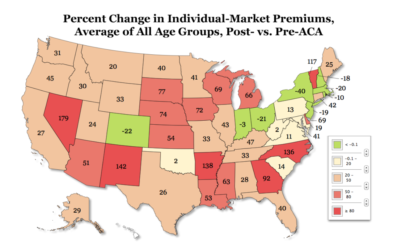
Yesterday, The Manhattan Institute released its most updated interactive Obamacare map. The map compares health insurance premiums pre-Obamacare to post-Obamacare that are offered to the following age groups: 27, 40, and 64.
The map below shows that average North Carolina premiums across all three age groups rank fourth highest nationwide.
Read here to learn more about the methodology used to calculate premium comparisons. Note that the average pre-Obamcare premiums were adjusted for pre-existing conditions, creating more of a sound comparison with post-Obamacare premium rates.


